Its no secret that designing for mobile devices is essential for modern web sites and web applications. ‘Mobile first’ has been the mantra for web designers for many years now, and for good reason. Well over half of all web users are accessing your website or web app on their phones, and they won’t stick around if their user experience is poor. Google knows this, so indexes sites based of the mobile version of the site content. So how do we go about developing functional responsive layouts in websites and web applications?
Before we dive head first into the how, it’s important to know what we’re trying to achieve.
We want to create a system that displays UI elements predictably at different device sizes
This helps create a predictable user experience across devices, and users love having their expectations met. This predictability can help us developers too. Being able to offload the responsibility of responsiveness to our layout system allows us to concentrate on more improtant things, such as making sure our applications work in Safari.
The 4/8/12 column layout
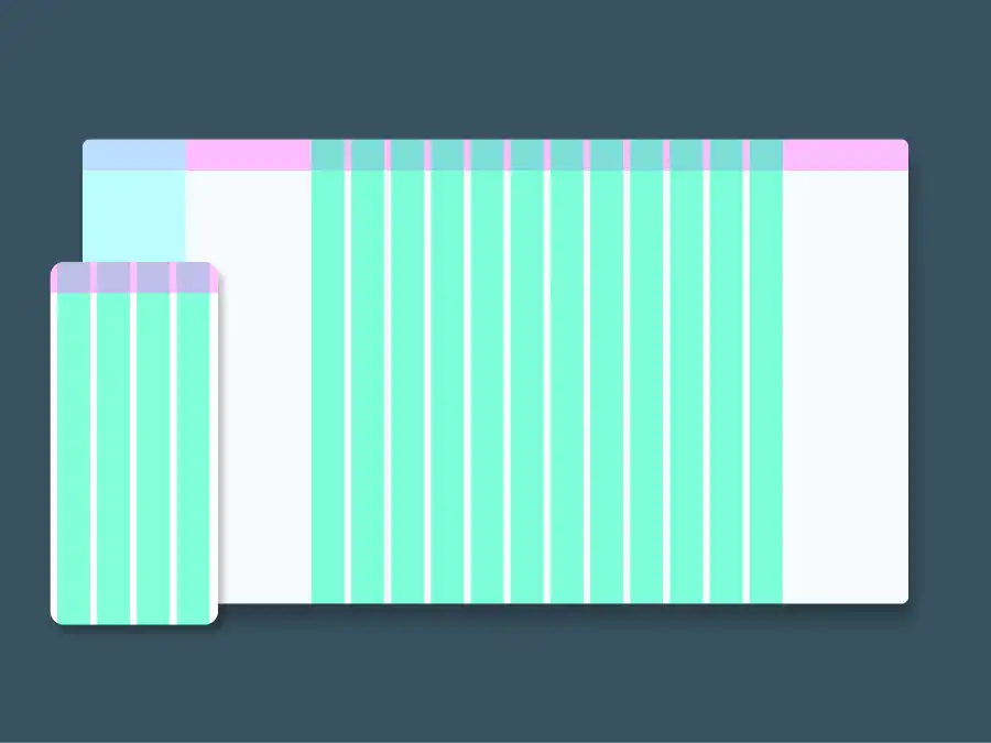
The 4/8/12 column layout is a design system commonly used in web design which will help our system adapt to different screen sizes. The 4/8/12 column system divides screen real estate into columns. 12 for large screens such as desktops and laptops, and 8 and 4 columns for smaller screens such as tablets and smartphones respectively, giving us predictable wrapping of elements.
Having fewer columns on smaller devices restricts us on how many UI elements we can fit across smaller screens, while remaining flexible on larger devices. This ensures your mobile UI remains uncluttered, and giving your elements room to breathe.
Material Design
Material Design is an open source design system developed by Google, and uses the 4/8/12 column system to define how elements are displayed. Their column layout definition is based on the parameters: screen width, number of columns, margin, gutter, and body width. Where margin is the margin either side of the content, gutter is the space between columns, and body width is the width of the content controlled by the columns.
Below is Material Design’s column layout definition from their documentation, which you can read more here.
Note: Gutter is 16px at all screen sizes
| Screen size | Example Device | Margin | Body | Layout columns |
|---|---|---|---|---|
| 0-599px | Smart phone | 16px | Scaling | 4 |
| 600-904px | Small tablet | 32px | Scaling | 8 |
| 905-1239px | Large tablet | Scaling | 840px | 12 |
| 1240-1439px | Laptop | 200px | Scaling | 12 |
| 1440px + | Desktop | Scaling | 1040px | 12 |
This definition is tested, solid, and versatile, and I assume cost a lot of money for Google to develop, so it is the definition I use. However, you can alter it to suit your needs. Maybe you want smaller gutters at smaller device sizes, or you want fixed body width and scaling margins across the board to further enforce the structure of your UI.
CSS Grid
Some of you keen eyed readers may have recognised that all of these fields in our layout definition can be build with good ol’ CSS.
We can define screen size with media queries, margin is self explanatory, we can get repeating columns with grid-template-columns and repeat, and gutter is our column-gap. Now that we have sufficient understanding of the who, what, whys and hows of our system, lets get hacking.
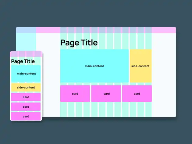
Let's say we have been given this gorgeous design that we have been tasked with developing:
And we start out with the following page structure in HTML:
<section>
  <div class="layout-columns">
    <h1>Page Title</h1>
    <div class="main-content">...</div>
    <div class="side-content">...</div>
    <div class="card">...</div>
    <div class="card">...</div>
    <div class="card">...</div>
  </div>
</section>
Lets start by styling the layout-columns container so that it meets our column layout definition. We'll define our breakpoints using media queries first.
/* Smartphone is our default styles.
 "Mobile first"*/

/* Small tablet */
@media only screen and (min-width: 600px) {
}

/* Large tablet */
@media only screen and (min-width: 905px) {
}

/* Laptop */
@media only screen and (min-width: 1240px) {
}

/* Desktop */
@media only screen and (min-width: 1440px) {
}
Next we will define our layout-columns class for smartphones. Recall our definition: 16px margin, a scaling body width, and 4 columns with a 16px gutter. Note grid-template-columns: repeat(4, 1fr); will give us 4 repeating columns of equal width.
/* Smartphone is our default styles.
"Mobile first"*/
.layout-columns {
  display: grid;
  grid-template-columns: repeat(4, 1fr);
  /* Gutter */
  column-gap: 16px;
  /* 0 vertical margin,
  16px horizontal margin */
  margin: 0 16px;
  /*  Scaling width.
  Will always fill container */
  width: 100%;
}
Now we can style the layout-columns class for the other device sizes inside our media queries. Remember, we only have to change fields that are different from the previous breakpoint. We don't need to redefine the entire class.
/* Small tablet */
@media only screen and (min-width: 600px) {
  .layout-columns {
    grid-template-columns: repeat(8, 1fr);
    margin: 0 32px;
  }
}

/* Large tablet */
@media only screen and (min-width: 905px) {
  .layout-columns {
    grid-template-columns: repeat(12, 1fr);
    margin: none;
    /* this is our body width */
    max-width: 840px;
  }
}

/* Laptop */
@media only screen and (min-width: 1240px) {
  .layout-columns {
    margin: 0 200px;
    max-width: none;
  }
}

/* Desktop */
@media only screen and (min-width: 1440px) {
  .layout-columns {
    margin: none;
    max-width: 1040px;
  }
}
Easy as! Now we can define how many columns our content boxes will span. We will use grid-column: span X; to achieve this. Looking at our mobile design, all our elements span all four columns, so we can go and set all their column spans to 4.
h1,
.content,
.side-content,
.card {
  grid-column: span 4;
}
Our desktop design is a bit more interesting. The header occupies its own row, spanning the full 12 columns, out main content spans 9 columns, with 3 columns for the side content. The cards each take up 4 columns each.
Because we also have 12 column layouts for the large tablet and laptop, lets asssume the same layout will work across these three device sizes and just define our column spans inside our large tablet media query
/* Large tablet */
@media only screen and (min-width: 905px) {
  .layout-columns {
    grid-template-columns: repeat(12, 1fr);
    margin: 0 16px;
    max-width: 840px;
  }
  h1 {
    grid-column: span 12;
  }
  .content {
    grid-column: span 9;
  }
  .side-content {
    grid-column: span 3;
  }
}
But hang on, what about our 8 column layout? I'll leave that up to you to try. You can get creative in how to display the 3 card elements across the 8 columns. Good luck!
If you want to check out this system in action, here's a working example.
Further hacking
So where to from here? With an understanding of how you can build a robust responsive layout system, take your new power away and see how you can apply it to your project and workflows. Try and recreate the system in a styling tool like tailwindcss or Bootstrap. You could even take it a step further and create a reusable layout component in your favourite framework (or UI library) such as Angular or React.
I hope responsive web development is a bit less of a headache for those of you new to the field (and those of you who aren't). If you have any questions, comments, or thoughts, feel free to send me a message below.
Happy hacking!

