Having the want to improve a piece of functionality past the requirements given is fantastic trait to have as a software developer. Having the support or even encouragement to pursue that improvement is something I value greatly from my managers. It only leads to codebases that are much easier to maintain, and better user experiences. I am fortunate enough in my job to have this encouragement to be a good boy scout when I get my grubby hands stuck into something.
An ongoing project I am working on is a UI overhaul of our member application. This involves migrating UI elements from 3rd party to in-house components, and enforcing a 4/8/12 column layout (something I went through here) across the pages. A project with many opportunities to improve user journeys and experiences.
A user experience that needs some love
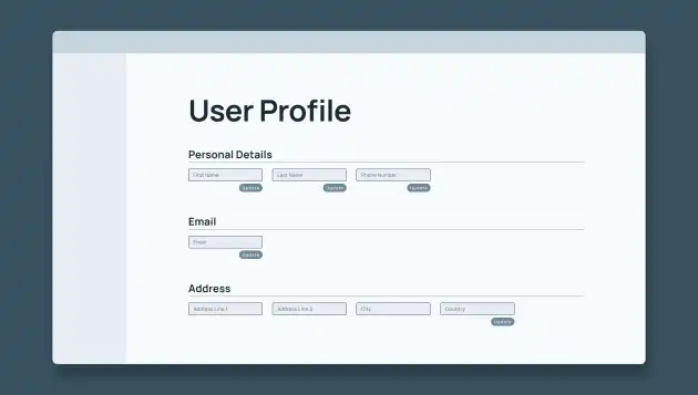
One such opportunity presented itself last week. I started to tackle the user profile page, which displays and allows editing of the personal information of the user. When I mentioned I was starting this page in our team's daily stand up, one of our senior developers piped up, exclaiming this page needs a major UX overhaul, and he wasn’t wrong.
The page exists in a perpetual edit state. User information is displayed in text inputs, each with its own update button. You have to click a whole different button for each field of your profile you want to update, what a bloody chore.Baffled, I went ahead and mocked up a new UI design, more in line with typical profile pages. User details displayed as plain text with a label, and a button which lets you edit the fields, with ONE update button. An easy win.
I spent an enjoyable few hours building this nice new UI, but had a realisation. I would have to call multiple endpoints at once to update the fields, an endpoint that consolidated these calls didn’t exist. I look around my desk. Not a single unoccupied backend dev in sight whom to click my fingers at and ask for a new endpoint.
I’m a brave frontend dev - writing code without immediate visual feedback only terrifies me a little. I will do it. I will make a new endpoint.
Braving the depths
I gathered up the tools I'd need for the journey - a headlamp and gumboots are essential tools when venturing into... the backend - and jumped in. Of course all this drama on my part was for no reason, each of these endpoints were nothing more than an interface that enabled the frontend to call an API provided by a Investment Administration Service. Sweet! All I need to do was wrap these 3rd party API calls in one endpoint for me to call, and we're away laughing.
So that's exactly what I did, it worked, and they lived happily ever after. The 3rd party endpoints that is. I still had some problems to solve.
Improving UX from the backend
An important consideration for frontend developers when consuming APIs is how to display errors back to the user. You need describe errors in a way that is meaningful, not confusing to users. This means not just dumping an error response onto the screen to scare someones poor old nan. I need to have a think about what I am sending back to my frontend self when the end point is called and it goes a bit pear shaped.
My new endpoint calls up to four other endpoints, we could have three succeed, and one fail. I need to let the frontend, and in turn the user, know that one of the fields failed to update without sending and error response for the whole request, as is typical when a request throws an error. I know what the frontend dev has in mind for his error display, as I am them, which makes the end goal of my error response clear.
I ended up creating a list of all the fields that failed to update, and sent them back to the frontend. This lets the user know what fields they would need to try and update again, or complain to our lovely Investor Services team about. It's an obvious solution, but my endpoint was still returning an error response, and cancelling any calls that hadn't completed. I was getting a bit stuck, but help came.
Unlocking a new skill
Looking up from my desk, I see the same senior backend dev that mentioned this UX rethink all those days ago. His figure framed by the mid morning sun like Gandalf arriving with the Rohirrim to save Helms Deep. He asks me: "Have you heard of Promise.allSettled()? It will wait until all calls are finished before returning a response. The Promise.all() you are currently using will immediately cancel any pending calls if one fails". "Promise.allSettled()?" I think to myself. "What is this new knowledge you have bestowed upon me?"
I felt like Link in The Legend of Zelda, having just obtained a skill that finally allows the player to solve the puzzle that seemed to have no solution. Promise.allSettled() allows me to catch any failed calls, and return something to tell the frontend which call failed, while allowing the other calls to finish successfully, and send a successful response. I could now wrap up my frontend changes confident that users will have a clear picture of what fields they will need to try again, should anything go wrong.
A conclusion
The past week has been packed with new experiences and learnings. I got to apply my UX knowlegdge to the backend development. I learnt how to deliver data to the client using GraphQL and Node.js. The advantage of having a backend based on Javascript means there is a low barrier to entry for a frontend dev like myself to get stuck in, and I find it so easy to learn by just getting stuck in, and stuck in I got.
It was also a humbling experience. I am confident in my Javascript skills, having spend the past 3 years neck deep in enterprise Javascript applications, but I was reminded that there is always something you don't know yet, a skill you haven't unlocked that will help you on your professional adventure.
I'd love to hear about skills you've recently gained. Let me know below!
Happy Hacking!


